
The Endowed Progress Effect
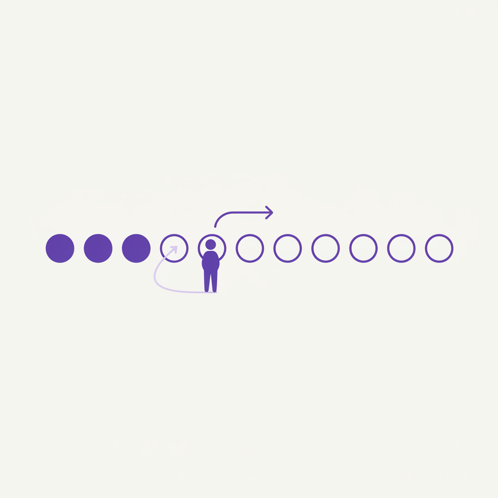
The Endowed Progress Effect is a psychological hack that gets users to complete a journey (like onboarding or profile setup) by giving them a head start. Instead of showing a user a 10-step process that is 0% complete, you reframe it as a 12-step process that is already 17% complete. This illusion of progress makes people significantly more likely to stick around and finish the task.
- Effort
- Low
- Cost
- Low
- Time to first result
- 1-2 weeks
- Best for
- SaaS, Apps, E-commerce
Save this strategy and send it to my inbox
Get the full playbook - scripts, tool stack and checklist - delivered as a single email you can act on today.
No spam. One email, and only what is worth reading.
Why This Works: The Psychology of a Head Start
This works because of a powerful cognitive bias. Once we feel we've started something, we're motivated to finish it to maintain consistency with our past actions. The feeling of 'I've already made progress' creates a personal commitment. Abandoning the task would mean accepting a loss, and we're wired to avoid losses (loss aversion). By 'endowing' users with progress, you give them something they don't want to lose.
The effect also reduces the perceived effort required. A task that is 0% complete feels like a bigger hurdle than one that's already underway. This initial momentum is often all that's needed to push a user past the initial friction of starting a new task. It transforms the user's mindset from 'Should I start this?' to 'I might as well finish this.'
Three real examples
LinkedIn's Profile Strength Meter
LinkedIn is a master of this. When you sign up, your profile strength meter isn't at zero. It's already partially filled because you've provided your name and email. This makes you feel like you're just a few steps away from a 'complete' profile, motivating you to add your job history, skills, and photo to reach 'All-Star' status.
Source: CXLDuolingo's Learning Path
Duolingo's onboarding immediately gives you a sense of accomplishment. After a very simple first lesson, you see a sprawling map of future lessons, but your first step is already lit up and complete. You've made tangible progress on your language-learning journey from the very first minute, which encourages you to continue to the next lesson.
Source: DuolingoThe Car Wash Stamp Card Study
The foundational study for this effect gave two types of loyalty cards to car wash customers. Group A got a card needing 8 stamps for a free wash. Group B got a 10-stamp card with 2 stamps already filled in. Both required 8 more purchases, but Group B had a much higher completion rate (34% vs 19%) because they felt they had a head start.
Source: Harvard Business ReviewThis effect is a core driver of 'gamification', as it functions just like earning the first few experience points in a video game for doing nothing.
The step-by-step playbook
- 1
Step 1: Identify a Critical User Journey
Choose one high-value sequence of actions you want users to complete. The best candidates are user onboarding, profile completion, or the path to a user's first core action in your product.
- 2
Step 2: Break the Journey into Steps
Map out the journey as a series of small, discrete tasks. Be granular. 'Complete Profile' is too big; 'Add a profile picture', 'Add your title', and 'Add your bio' are better.
- 3
Step 3: Find 'Freebie' Progress
Identify actions the user has already taken just by signing up. Providing an email address, choosing a password, or giving their name are all valid steps you can grant them credit for.
- 4
Step 4: Reframe the Journey
Redraw your journey map to include the 'freebie' steps at the beginning. If the original journey was 5 steps, the new one might be 7 steps, but the user starts on step 3.
- 5
Step 5: Design a Visual Progress Indicator
Create a clear, compelling visual to show progress. Progress bars, checklists, or a series of 'unlocked' step icons all work well. The key is to make it instantly understandable.
- 6
Step 6: Display the 'Endowed' Progress Immediately
The first time a user sees the progress indicator, it must already show the initial steps as complete. This is the core of the entire tactic; seeing progress from second one is what creates the effect.
- 7
Step 7: A/B Test Your Implementation
Roll out the new flow to a segment of your users and compare its completion rate against your old flow. This is the only way to know for sure if it's working and by how much.
The Ask: Get Feedback on the New Flow
After you've implemented the new flow, you need to know how it feels to users. Use this simple email template to ask users who just went through it.
Subject: Quick question about your {ProductName} setup?

Hi {FirstName},

Thanks for signing up for {ProductName} the other day!

I'm the founder, and I'm trying to make our setup process as smooth as possible. You were one of the first people to try our new onboarding checklist.

Could you do me a huge favor and let me know what you thought? Did it feel helpful? Confusing? Any feedback is super valuable.

Thanks,
{YourName}
Key Questions Before You Start
- What is the single most important journey a new user needs to complete to become successful with our product?
- Can we break this journey down into 5-10 small, concrete steps?
- What progress has the user *already* made just by creating an account?
- How can we visually represent this 'head start' in a way that feels encouraging, not deceptive?
- What is the immediate reward or benefit for the user upon completing this journey?
Focus on the first question. If you apply this tactic to a journey that doesn't lead to the user's 'aha!' moment, any gains will be meaningless.
Recommended tools
June.so
Starts freeUse June to define your user journey and track completion rates. It's essential for measuring the impact of your A/B test.
Tally.so
FreeUse Tally to build a simple survey to collect the qualitative feedback from the email script above. It's fast, free, and easy to use.
Figma
Free tier availableUse a design tool like Figma to mockup and perfect your visual progress indicator before committing engineering resources.
Writtenlabs AI
Starts freeUse Writtenlabs AI to generate different copy options for your progress bar and surrounding microcopy.
Prices are indicative and change - check the vendor before buying.
Do it faster with AI Prompts
Brainstorm Onboarding Steps
Act as a senior product manager. My product is a {e.g., AI-powered newsletter writing assistant}. A new user has just signed up using their Google account, so I have their name and email. Break down the ideal onboarding journey into 6 distinct steps that lead them to creating their first draft. The first 1-2 steps should be based on the information I already have.
Write Progress-Based Microcopy
I'm creating an onboarding checklist for my SaaS product, {ProductName}. A user has just completed Step 2 of 5. Write 5 different options for a short, motivational headline to display above the checklist that acknowledges their progress and encourages them to continue.
Create a User Re-engagement Email
Write a short, friendly re-engagement email for a user who signed up for my app, {e.g., a personal finance tracker}, but didn't finish the setup. The user completed 2 out of 4 onboarding steps. The goal is to get them to come back and finish. Emphasize how close they are to being done, using the Endowed Progress Effect.
Mistakes that kill this play
- Making it feel fake. If you claim 'Account Created!' is step 1 of 20, the effect is lost.
- Creating too many steps. 5-7 steps is a good range. 20 steps is a chore, even if you start on step 3.
- Not using a visual. The user must *see* the progress for it to have an impact.
- Applying it to a low-value task. Don't waste this on 'Read our privacy policy'.
- Having no clear reward. The user needs to know *why* they should complete the steps. What's in it for them?
- Failing to A/B test. You might make things worse. Test every change.
- Progress that goes backward. Never take away progress a user has 'earned'.
Your First 7-Day Sprint
- Day 1: Decide on the single most critical user journey to apply this to. Get your team to agree.
- Day 2: Map out the journey and identify 1-2 'freebie' steps you can grant users from the start.
- Day 3: Design the new progress indicator in Figma. Write the microcopy for each step.
- Day 4: Get engineering estimates and schedule the build. Prepare your analytics by setting up a goal funnel in a tool like June.so.
- Day 5: While it's being built, prepare your A/B test. Define your hypothesis (e.g., 'This will increase onboarding completion by 15%').
- Day 6: Deploy the new flow to 10% of new users.
- Day 7: Monitor the results. Check for bugs and watch the completion rate of the test group vs. the control group.
Save this strategy and send it to my inbox
Get the full playbook - scripts, tool stack and checklist - delivered as a single email you can act on today.
No spam. One email, and only what is worth reading.